

Instructions
Start with Design 2.2 (your colours and fonts) and 2.3 (your logo), then Content 3.1 to 3.3 (your people, firm details and form), and finish with the launch checklist below. Animations is optional.
01 Structure
Built on Client First.
2.1
Page structure
Every page runs Navbar, main wrapper, Call To Action and Footer. Each section uses section_block, padding-global and container-large.
- Change spacing on section_block and padding-global, not on single sections.
- To add a page, duplicate Case studies and keep its structure.
- Text uses shared classes such as section-head_heading, row_text and text-label, so most edits are a class swap.
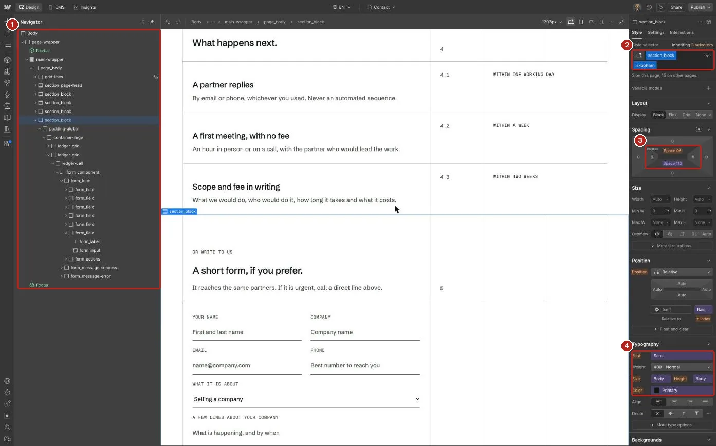
1 Navigator: page-wrapper, main-wrapper, then one section_block per section. 2 The selected class. 3 Padding set with Spacing variables. 4 Type set with Typography variables.
The ruled grid
Content sits on ledger-grid, a four column grid of 7fr, 1.5fr, 1.75fr and 1.75fr. The grid-lines block behind each page draws the same four columns. Change both classes together so the rules stay aligned.
02 Colour and type
Change the brand in Variables.
2.2
Colour
The Variables panel has three collections: Colors, Spacing and Typography. Colors holds only the colours the template uses: Green 50 to Green 950, Neutral 0 to Neutral 600, Red 600 for form errors, and overlay tints. Elements use semantic colours such as Text Color/Secondary and Border Color/Primary, which point at those ramps, so a brand change is one edit per ramp.
- Ink sets text, rules and the dark buttons.
- Bank green (Green 900) sets the Footer and the dark bands.
- Sage (Green 100) sets the Call To Action band and the Services deck cards.
- Mist sets links and text on dark green.
- Signal red marks form errors only. Button hovers use Green 800.
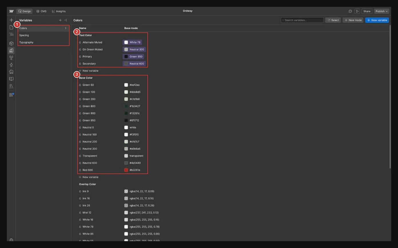
1 The three collections. 2 Semantic colours such as Text Color/Primary, each pointing at a ramp. 3 The Base Color ramps, ordered light to dark.
Type
Schibsted Grotesk sets headings and body text. Geist Mono sets labels, figures and dates. Both load from Site settings, Fonts, and the Sans and Mono font variables point at them. Sizes, line heights and tracking live in Typography. Its Tablet, Mobile landscape and Mobile portrait modes switch on at each breakpoint, so H1, H2 and the lead text scale down without breakpoint overrides.
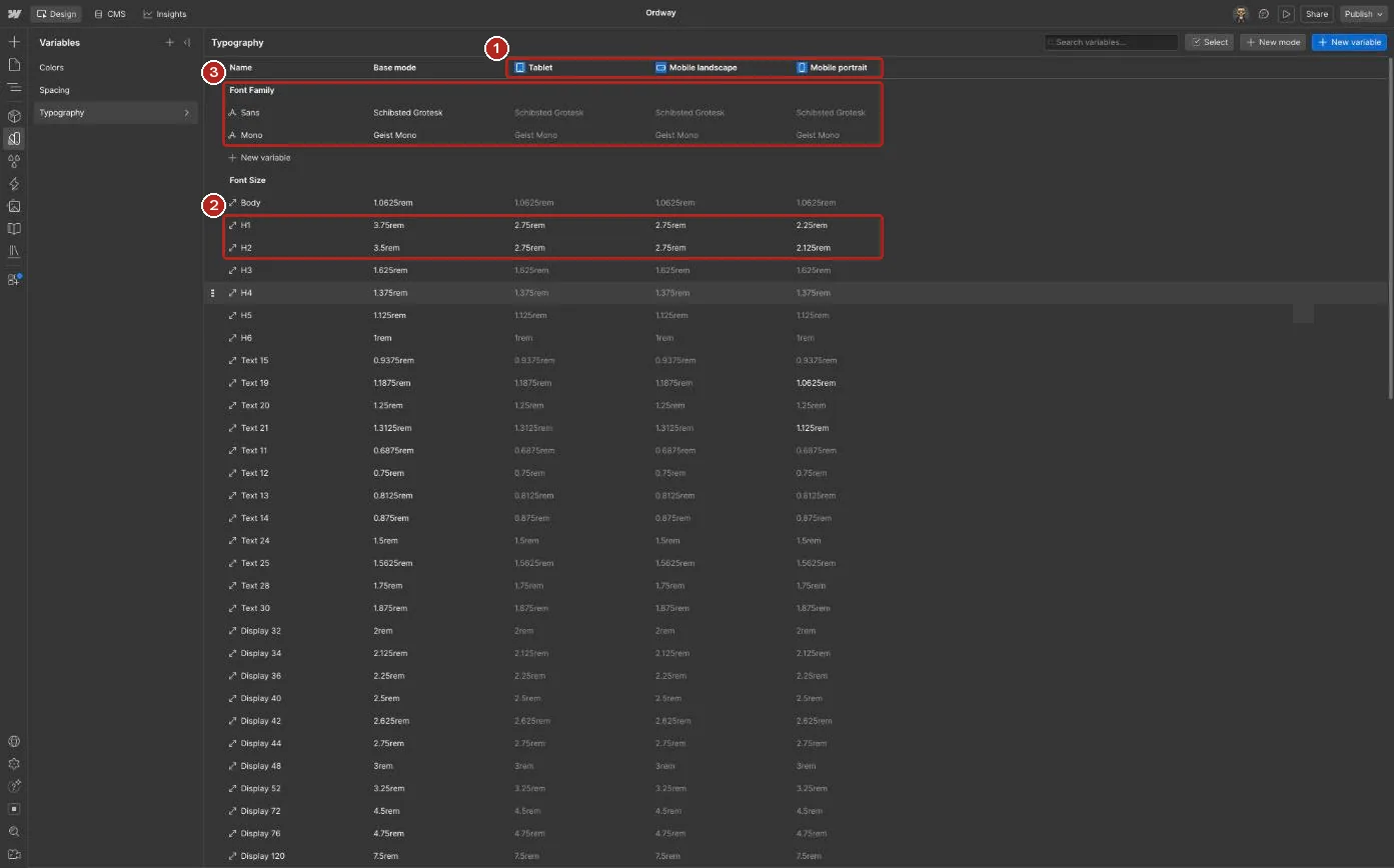
1 Tablet, Mobile landscape and Mobile portrait modes. 2 H1 and H2 take a new value in each mode. 3 The Sans and Mono font variables.
03 Components
Edit once, update everywhere.
2.3
Navbar
Main links, the side menu and the call to action. Set Variant to Over image on a photo header, or Solid on every other page. The logo is two SVG images: the white one shows on Over image, the ink one on Solid and in the side menu. Swap both for your own logo inside the Navbar component.
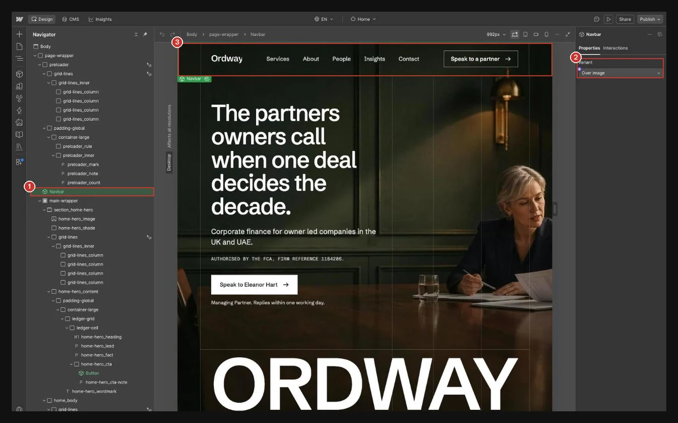
1 The Navbar instance in the Navigator. 2 The Variant property, here Over image. 3 The Navbar on the canvas.
Call To Action
The closing band above the Footer. Select an instance and edit its fields in the right panel: Label, Heading, Response and Number under Content; Photo, Photo alt, Name and Role under Partner; Phone, Phone link, Email and Email link under Contact. Set Number to one more than the last section head on the page. On the Partner, Case study and Insight templates the partner fields read from the CMS (the partner, the lead partner and the author), so every page names its own partner. The two office addresses sit inside the component: edit them once.
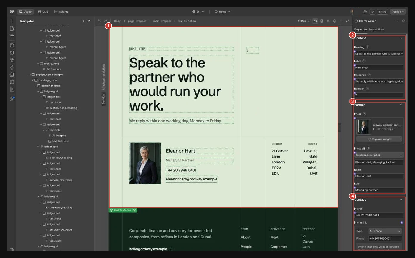
1 The Call To Action instance on the canvas. 2 Content: Heading, Label, Response and Number. 3 Partner: Photo, Photo alt, Name and Role. 4 Contact: Phone, Phone link, Email and Email link.
Footer
Offices, links, the template links and the regulatory line. Double click the Footer on any page to open the component, edit the text, then click outside it to close. Every page updates.
Section Head
The ruled head above most sections: Label, Heading and Number props. Select an instance and type over the text, or change the props in the right panel. Restyle every head at once inside the component. On the Service template two headings read from the CMS (Problem heading and Stages heading).
Button and Person Card
Select a Button or Person Card on the page and edit its fields in the right panel. Button takes Label and Link, with three variants: Dark, White and Outline light. Person Card takes the portrait, alt text, name, profile link, role, focus, direct line and email, and runs the partner cards on About and Contact.
04 Images
Swap in your own images.
2.4
Sizes
Every photo is there to show the layout. Replace them in the Assets panel or on each CMS item.
- Page header images: 2000 by 1120 px
- Section and case images: 1344 by 752 px
- Portraits: 880 by 1168 px, 3:4
- WebP under 150 KB
- Alt text on every image that carries meaning
01 CMS
Five collections run the site.
3.1
Insights
Articles. Featured leads the Insights page. Published, Reviewed and Next review show on every article. Topic, Author and Related service link each article to the rest of the site. Write each section of Body under an H2, with H3 for points inside a section.
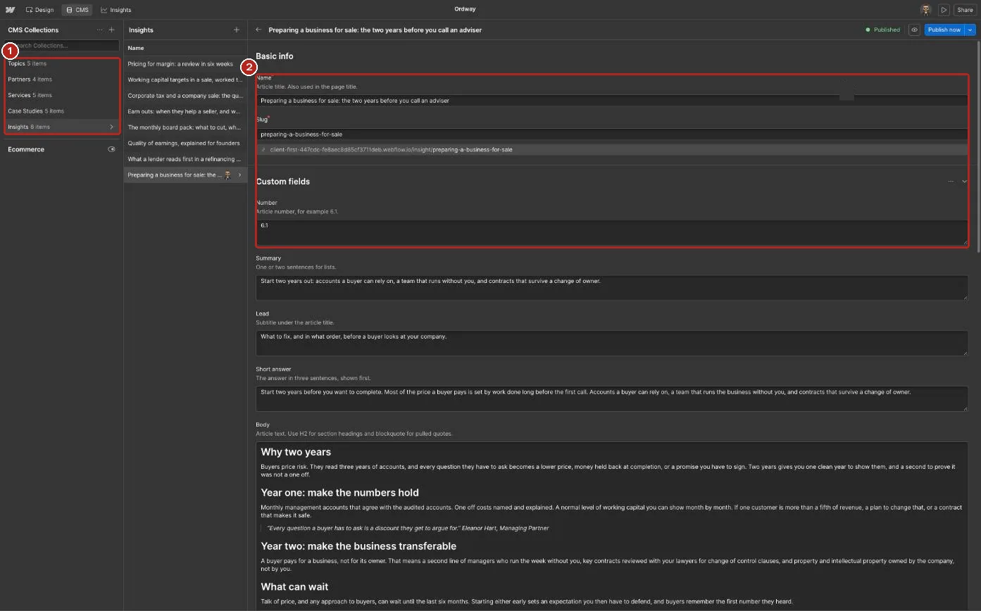
1 The five collections. 2 Each field carries help text that says what it controls.
Partners
A profile page per partner. Office sets London or Dubai. Order sets the sequence on About. Their cases, articles and services list themselves from the references.
Services
Service pages and the Services deck. Lead partner links the service to a partner. Stages and fee fields fill the page.
Case studies
Anonymised cases. Service and Partner link each case to its pages. Completed date sets the order.
Topics
Groups articles into topic pages. Order sets the sequence of the topic menu.
02 Regulation
Replace the firm details.
3.2
Fictional firm details
Ordway is a fictional firm. Its regulator references, company number, addresses, phone numbers, memberships, deal sizes and results are made up. Replace each one with your own in the pages, the Footer and Call To Action components, and the CMS. The London numbers use the UK range reserved for drama, so they never connect to a real line.
- Partner pages link to the FCA register and the DFSA public register. Point them at your own entries.
- Check every regulatory line with your compliance lead before launch.
03 Forms
Send the form to your inbox.
3.3
Recipients
Set recipients in Site settings, Forms. Success and error states are styled. Edit their text from the form’s state switcher.
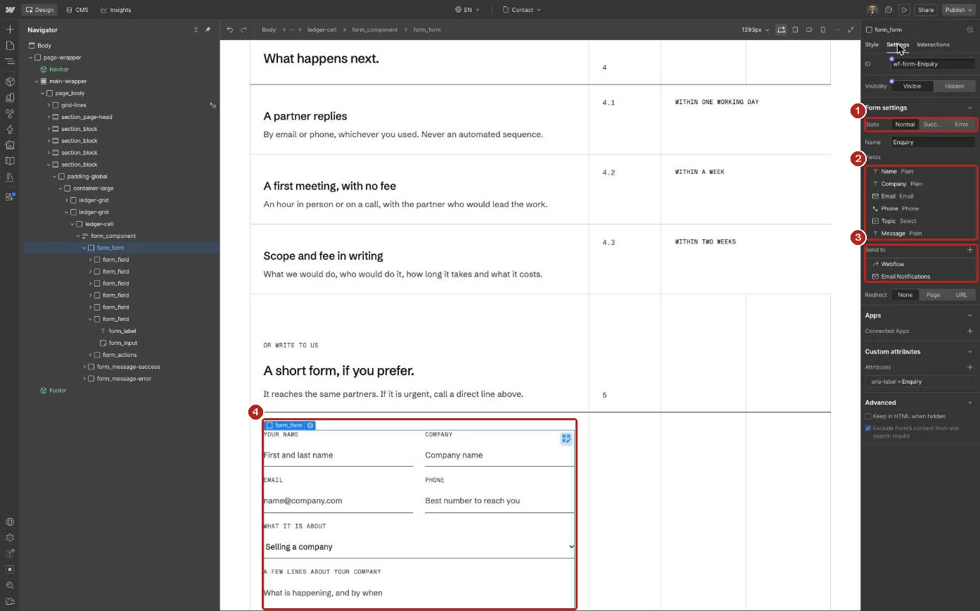
1 Normal, Success and Error states. 2 Field names as they arrive in your inbox. 3 Where submissions are sent. 4 The form on the canvas.
01 Interactions
How to Edit GSAP Animations
4.1
Webflow Interactions
Motion runs on Webflow Interactions, which are built on GSAP. Each is named page first, then action, such as Global / Menu open. Global means it runs on every page.
- Open the Interactions panel.
- Pick an interaction by name.
- Select an action to change its duration, delay or ease.
- To skip it on one breakpoint, add a conditional playback rule.
- To remove it, delete the interaction. The element shows in place.
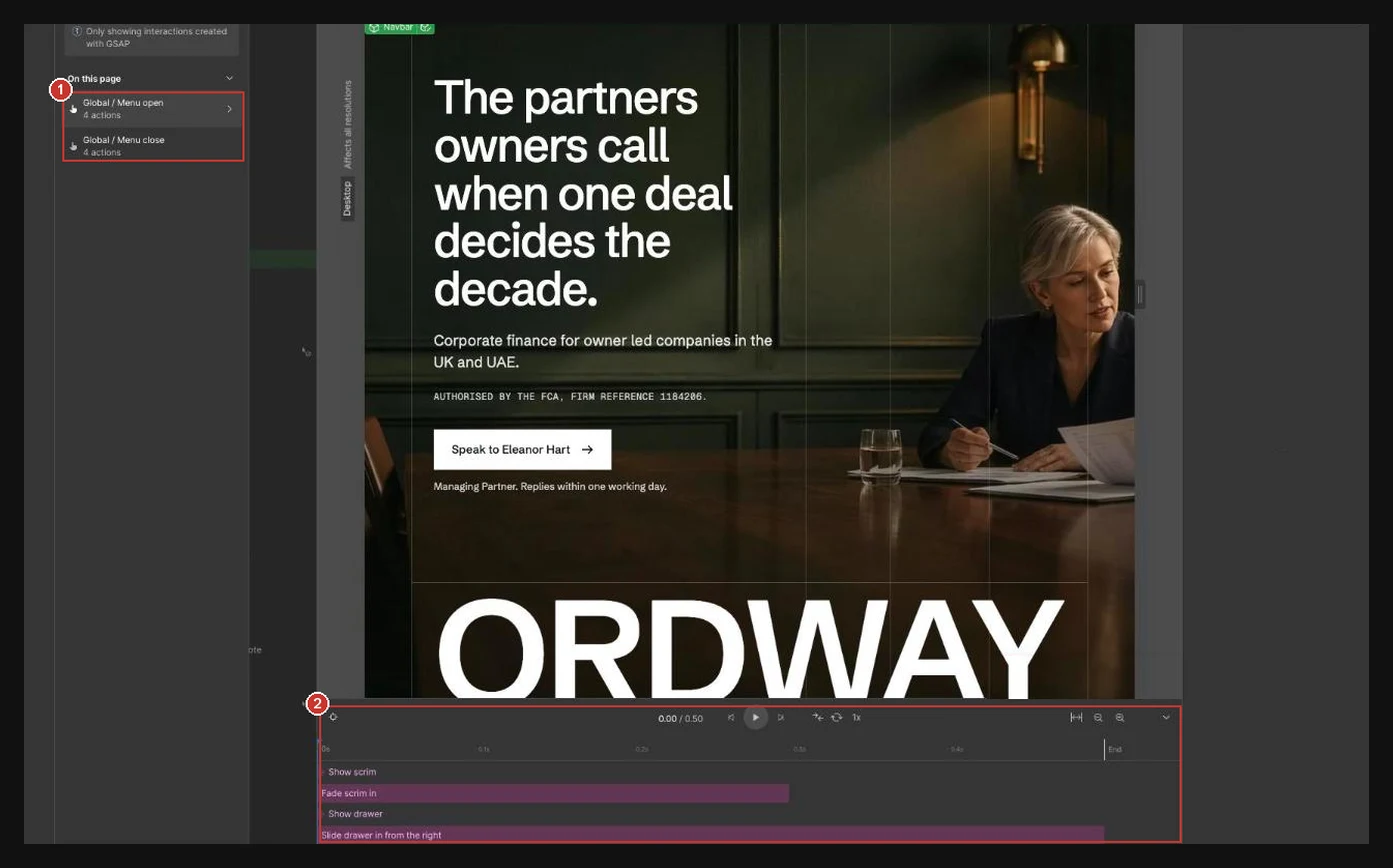
1 The named interactions on this page. 2 The Global / Menu open timeline.
02 What moves
Interactions by name.
4.2
Preloader
Step 0 of the GSAP / Global / Reveals block, on Home only. On load the panel is drawn as a ledger: the column rules draw down, the base rule draws across, the ORDWAY letters rise and the count runs to 100. Then the panel opens column by column along the same rules into the hero. It rests off screen, so the Designer stays clear, and it stays hidden for visitors who reduce motion. To switch it off, delete the preloader block on Home; the code then finds nothing and skips it.
Side menu
Global / Menu open and Global / Menu close. The drawer slides in from the right and the page behind it blurs.
Reveals
One block in Site settings, Custom code, Footer code, starting with the comment GSAP / Global / Reveals. The hero always reveals first: titles and leads rise line by line out of a hidden mask, the ORDWAY wordmark rises while its rule draws in, and the grid lines draw down. Then the rest of the page follows as it arrives: ledger lines draw from left to right with their rows, photos wipe up and settle, cards rise in, and the Services deck opens with its first service. Any other text in the page content, such as notes, sources and footer links, fades up as it arrives, so nothing sits still while the rest moves. Each plays once, and nothing moves for visitors who reduce motion. The class lists in the block (TITLES, LEADS, MARKS, FRAMES) set what moves, and TIME sets how long each reveal takes (see Key settings in 4.4). To remove it, delete the block from its comment to its closing script tag, and everything shows in place.
Hover states
Buttons, links and rows use Style panel hover states, not Interactions. Underlined links draw their line with a background on the link class, so on hover it sweeps out and back in. Partner and case photos ease closer, and link arrows nudge right, from one short block in Site settings, Custom code, Footer code, starting with the comment GSAP / Global / Hovers. Hover out always eases them back. Edit the SETS list to change what moves.
03 Custom code
GSAP in custom code.
4.3
Services deck
One short block in the Services page settings, Custom code, Before body tag, starting with the comment GSAP / Services / Deck. It switches the five services from the tabs and arrows, moves on every 7 seconds and stops on Pause. Keyboard users tab along the service tabs, each one shows its service as it takes focus, and keyboard focus in the deck stops the autoplay. On each change the old lines drop down out of view and the new ones rise into place; OUT and IN at the top set how long that takes.
- To change the timing, edit the settings at the top of the block.
- To remove it, delete the block from its comment to its closing script tag. The deck then shows the first service.
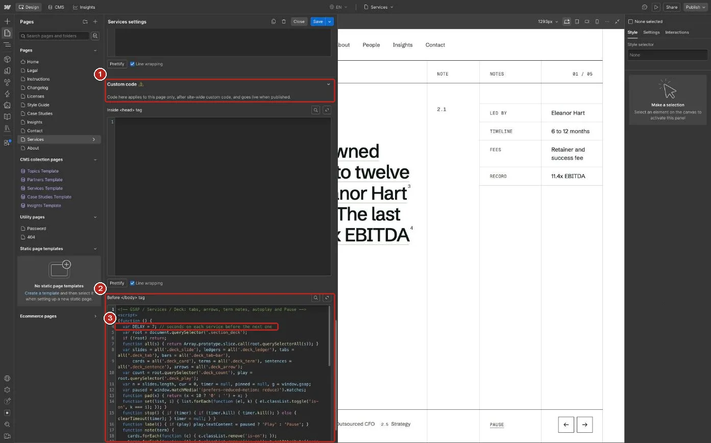
1 Custom code in the Services page settings. 2 The Before body tag block. 3 DELAY sets how many seconds each service shows.
How we work steps
One short block in the Home page settings, Custom code, Before body tag, starting with the comment GSAP / Home / How we work steps. The steps follow the scroll: the step crossing the middle of the screen lights up, its bar fills as the visitor scrolls through it, and its photo wipes up over the last one. Nothing runs on a timer, so there is nothing to pause. LINE at the top sets where on the screen a step lights up, and WIPE how long the photo change takes.
- To change the timing, edit the settings at the top of the block.
- To change a photo, select it inside the image frame on Home. Photos follow the order of the steps.
- To remove it, delete the block from its comment to its closing script tag. The first step and its photo then show on their own.
Article contents
One short block in the Insight template settings, Custom code, Before body tag, starting with the comment GSAP / Insight / Contents. The On this page rows above Written by are native section links: The short answer, The full answer, Sources and Read next. As the visitor scrolls, the row for the part being read turns ink. The list hides from tablet down, where the sidebar sits below the article.
- To change the list, edit it on the Insight template: duplicate a row, change its number and label, and point its link at another section that has an ID in its element settings.
- To restyle the rows, select a row inside On this page on the Insight template. All four share the article_toc-link class, and the combo class is-active marks the row being read.
- To remove it, delete the On this page block in the sidebar, then the block from its comment to its closing script tag.
04 GSAP guide
Element map, settings and removal.
4.4
Element map
Every class the GSAP blocks animate, what it does and which block runs it. Visitors who prefer reduced motion see every element in place with no movement.
- .preloader on Home: the rules draw down, the count runs to 100, then the panel opens column by column. Reveals, step 0.
- .home-hero_heading, .page-head_heading, .service-hero_heading, .article-head_heading, .section-head_heading, .contact_heading, .feature_heading, .subscribe_heading, .office_name, .deck_title: titles rise line by line out of a mask. Reveals, step 1.
- .home-hero_lead, .page-head_lead, .service-hero_lead, .case-quote_text: leads and quotes rise line by line. Reveals, step 1.
- .home-hero_wordmark, .footer_wordmark: the ORDWAY wordmark rises while its rule draws in. Reveals, step 1.
- .ledger-grid, .footer_legal, .steps_list: each row draws in from left to right behind its line. Reveals, step 2.
- .text-label, .text-note, .breadcrumb inside section heads: fade up as their row draws. Reveals, step 3.
- .person-card_image-wrap, .case-card_image-wrap, .page-image_wrap, .feature_image-wrap, .partner-head_image-wrap, .office_media, .approach_image-wrap: photos wipe up and settle from a slight zoom. Reveals, step 4.
- .who-card, .person-card, .case-card, .question-card and the blocks inside .article_body: rise in as a group. Reveals, step 5.
- .grid-lines_inner: the column lines draw down. Reveals, step 6. Anything else inside .container-large fades up in step 7.
- .button_icon, .text-link_icon, .person-card_image, .case-card_image, .feature_image: arrows nudge right and photos ease closer on hover. Hovers block.
- .deck_slide and its tabs on Services, .steps_list on Home, .article_toc-link on the Insight template: the three page blocks described above.
Key settings
Open Site settings, Custom code, Footer code. Near the top of the GSAP / Global / Reveals block are two settings. START sets when an element reveals: top 88% means when its top reaches 88% of the way down the screen, and top 75% reveals later. TIME sets how many seconds each kind of reveal takes: title, lead, wordmark, line, label, photo, card and grid. Change a number, save and publish.
// GSAP / Global / Reveals
var START = 'top 88%'; // how far up the screen an element is when it reveals
var HERO_AT = 0.15; // when the hero starts, in seconds
g.to(batch, { clipPath: SHOW, duration: 1.1, ease: 'power3.inOut', stagger: 0.08 });
Keep every TIME value at 0.8 or below, the range Webflow recommends; a lower number feels quicker. Next to each title and lead, stagger sets the gap between lines, and a smaller number brings them in closer together.
// GSAP / Global / Reveals, step 1
var v = { yPercent: 0, duration: mark ? 1.4 : (title ? 1.1 : 0.9), ease: 'expo.out', stagger: title ? 0.09 : 0.06 };
Hover strength and speed sit in the GSAP / Global / Hovers block, in the list under Cards. Each line has to (raise 1.05 to 1.1 for a stronger zoom) and duration (seconds, lower is quicker).
// GSAP / Global / Hovers
{ card: '.person-card', part: '.person-card_image', prop: 'scale', to: 1.05, duration: 0.6 }
Page blocks. DELAY is how long each service stays on screen, and LINE is where on the screen a step lights up as the visitor scrolls. OUT, IN and WIPE set how long each change takes; keep them at 0.8 or below.
// GSAP / Services / Deck
var DELAY = 7;
var OUT = 0.45, IN = 0.7;

// GSAP / Home / How we work steps
var WIPE = 0.8;
var LINE = 'top 55%', END = 'bottom 55%';
Remove an animation
- Open Site settings, Custom code, Footer code for Hovers and Reveals, or the page settings of Services, Home or the Insight template for the page blocks.
- Select the block from its comment line, such as GSAP / Global / Reveals, down to its closing script tag, and delete it. The plugins are switched on in Site settings, GSAP integration: SplitText is used only by Reveals, Text by Reveals and the Services deck, and ScrollTrigger by Reveals, the How we work steps and the article contents. Untick a plugin only when no remaining block uses it.
- There is no separate ScrollTrigger to clean up: each block creates its own triggers, so they go with the block. Save and publish.
- What changes: without Reveals every element shows in place on load and the Home preloader stays hidden above the screen. Without Hovers, Style panel hover colours still work but photos no longer zoom. Without a page block, the first service, the first step or a plain sidebar shows on its own.
Before launch
Eight checks before you go live.
5
Launch checklist
- Replace every image, partner, case and article with your own.
- Replace the fictional regulator names, reference numbers, company number, addresses and register links with your firm's own.
- Rewrite fees and timelines for your firm.
- Write an SEO title, description and Open Graph image for every page and CMS template, and replace the favicon and webclip in Site settings.
- Set form recipients in Site settings, Forms.
- Point the Privacy notice, Terms, Cookie choices and Complaints links in the Footer at your own pages.
- Draft or delete Instructions, Licenses, Changelog and Style guide, and remove their Footer links.
- In Site settings, Publishing, turn on Minify HTML, CSS and JS, then publish the whole site once more.
Next step
Speak to the partner who would run your work.
We reply within one working day, Monday to Friday.
6

21 Carver Lane
London EC2V 6DN
Level 9, Gate Village 3
Dubai, UAE